

All set with your shiny new app! Congrats! Now before you hit the Apposphere, there are few rules of the playground. And you should be aware of them when creating artwork for the stores. To ease up the process for you, we crunched the essentials into an artwork guide with requirements for the iOS App Store and Google Play.
Let’s jump right in!
You should know by now that your screenshots are the component with most impact in the First Frame of your Product Page. With most occupied screen real estate they are likely to influence most visitors of your product page.
The iOS App Store requires a set of screenshots for every device:
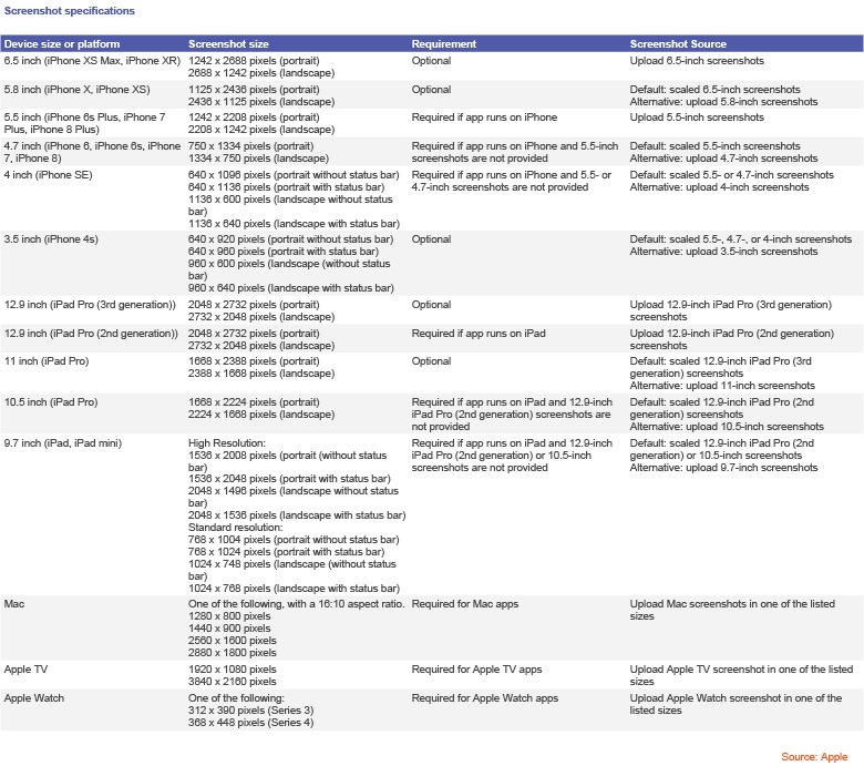
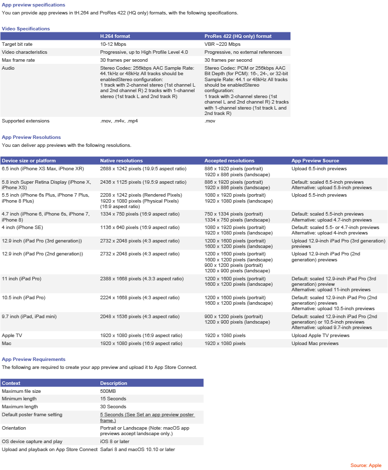
For App Preview Videos you can choose from portrait and landscape format. Keep in mind that Preview Videos always appear before screenshots, in the Gallery.
Resolution wise, you are to choose between Apple’s native resolutions and some allowed resolutions that get scaled to native. Just like you can see below:
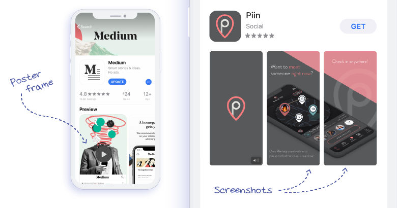
You should think of the poster frame as an image snapped from the App Preview Video. This particular image will be used as a thumbnail for the video. Choose the frame carefully having 2 things in mind: impact and engagement.
If you find an image that will please the retina, you are close to providing the necessary impulse for your visitors to press play, thus bringing them closer to downloading your app. One important bit about poster frames: make them in the same style as your other screenshots. You don’t want them to seem awkward and out of place.
One step after the other, as described here.
Alongside screenshots, the app icon is one of the first elements that users see on your App Product Page.
Therefore, it is imperative to have an icon that arouses the interest of the visitor while being faithful to the app’s utility and purpose. Keep in mind that, while the users scroll down the app page, the header stays visible. This is making the app icon also visible and enhancing the potential impact.
The requirements for the icon of the app are:
Resolution wise: 512 x 512 pixels or 1024 x 1024 pixels
Accepted formats: jpg, png
According to the guys at Splitmetrics.com, testing and optimizing the app icon alone can boost the conversion by as high as 26% on average. We can all agree that is quite a lot.
For a more in-depth analysis of the importance of the app icon design and its conversion enhancing capabilities, check out this piece.
If you must research this aspect, it is safe to say your app is on the right path to becoming a hit.
If you get selected to have a product page you know the artwork will be placed as a header, on top of the page. The same placement is used by Apple for the artwork on your developer page.
The requirements are:
Dimensions: 4320 x 1080 pixels
File types accepted: psd, zip
Naming convention: AppName_AppleID_AppStore_Product-DeveloperPage
Since every specific device has its own crop dimensions, you should know there is a safe area that will show on all devices. To be sure you get it right, get the template from Apple.

You might also want to check the full list of guidelines for this section of the product/developer page are offered by Apple here.
The minimum of screenshots you should have for Google Play is two, and the maximum is eight, either in landscape or portrait format.
Since a couple of months ago, the screenshots gained a bigger exposure in Google Play for they are now placed in the upper half of the front page of the product. You could argue that they are the core element of the first impression frame.
Screenshots becoming more prominent is not all, for now, the screenshot slider contains a video preview as the first screenshot.
That being said, if you don’t yet have that stunning preview, Marlin Motion is here to fix that.
The Google Play requirements are:
Minimum dimension: 320 pixels
Maximum dimension: 3840 pixels
Accepted formats: jpg, png
Aspect ratio can’t be more than 2:1 or 1:2
As the name points, the feature graphic is an image used by Google Play when they recommend your app. Since the majority of apps have a preview-video, the feature graphic will usually have a Play button overlaid on top of it and will allow the video to be played instantly, on click.
Unlike iOS App Store where you have to use a frame of the video as a thumbnail to be displayed before the screenshots, in Google Play you have to upload the asset separately.
See the requirements for the Google Play feature graphic:
Tip from Google Play: A feature graphic is required for all apps that get a feature placement. Apps without a feature graphic won’t be considered, so add an image to make sure you don’t exclude your app from this opportunity.
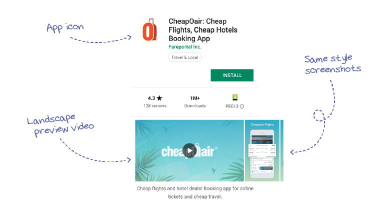
As said above, the app-preview video is now displayed as the first screenshot, above the fold, with a play button overlay.
Make sure you choose the best poster frame to use as a hook for users. And don`t forget the two words to be set in stone: engagement and impact.
The requirements for the app preview video are:
Recommended size: 1920 x 1080 pixels
Minimum length of 30 seconds
Maximum length of 2 minutes
Accepted format: YouTube URL
Note: Take a few moments to check this really well-crafted material to fully grasp the intricacies of Google Play Store in terms of AppStoreOptimization.
Leave aside that the icon`s value is embedded in our receptive patterns when it comes to digital/online behaviour, when it comes to App Store, the icon has a particularly important role in terms of first impression and when it comes to suggesting app`s utility and scope.
Requirements for the app icon in Google Play store:
Resolution wise: 512 x 512 pixels
Size: 1024 KB file size limit
Accepted format: png (with alpha)
For a comprehensive and exhaustive list of app store asset requirements, go here.
Once you got the requirements right, you should start prioritising your efforts towards the features that have the most impact and influence on the overall decision of the app user. Hence, growing your app`s chance of getting downloaded.
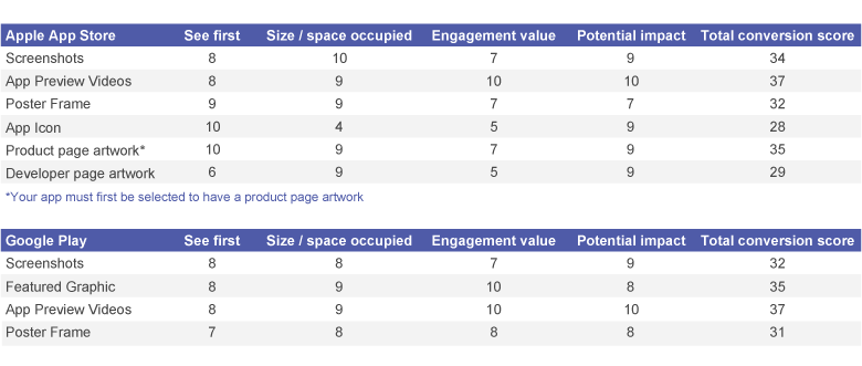
Disclaimer: Keep in mind that the estimations below are not applicable to each and every app, but rather hint towards the common characteristics of each store together with the behavioral patterns of users on iOS AppStore & Google Play.
What a surprise! Video previews are the top scorer! Just kidding – it does not come as a shock to anyone anymore. We wrote a piece about the power of preview videos to drive conversion here.
Conclusion: Many pros in the business say developing and delivering an app is nothing short of a hectic job – let alone the fact that you must get downloads to make the effort worth. Marlin Motion strives to make the entire process much easier for you. Once you are ready to get the downloads train to leave the station – or better yet, set it in motion – get in touch and let us make it happen.